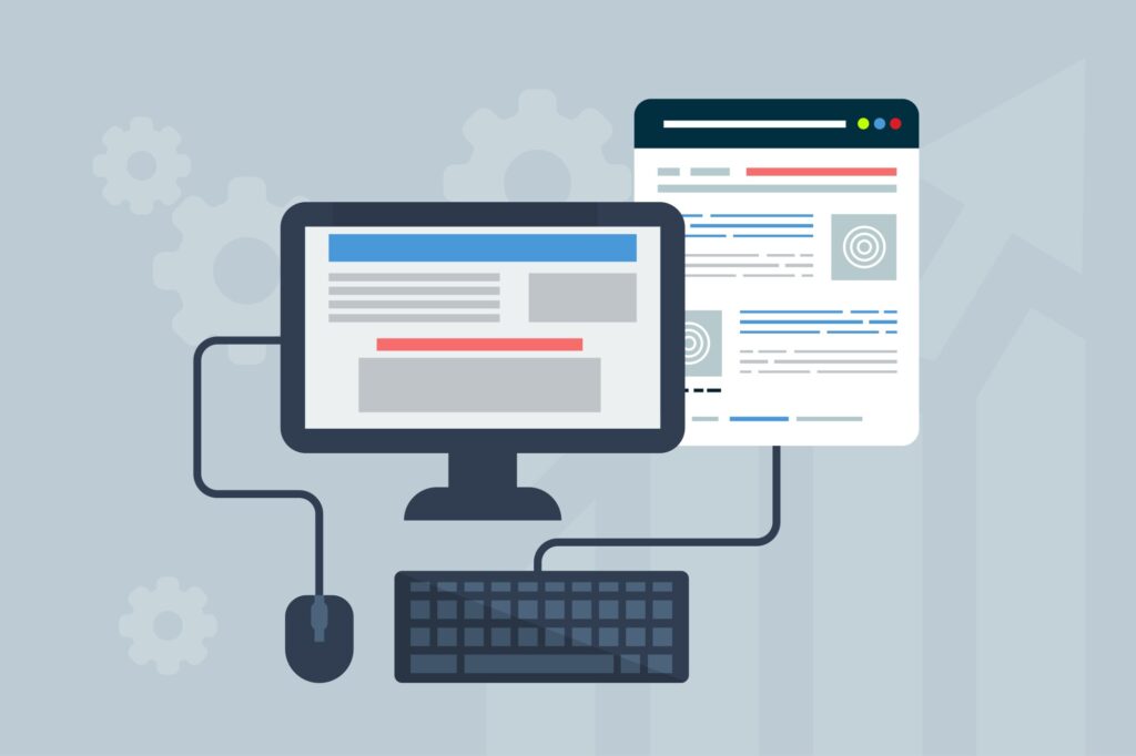
Build a Website That Works: 7 Expert Tips for Website Design That Converts
September 24, 2020

Build a Website That Works: 7 Expert Tips for Website Design That Converts
7 Expert Tips for Website Design That Converts
Build a website that converts your visitors into leads and customers. Website design matters, use these tips for boosting your business' success.
Keyword(s): website design
Even with the internet now touching almost every aspect of our lives, 36% of businesses say they still don't have a website.
Whether you've decided to move your company into the digital age, or it's time to revamp your site, website design can be overwhelming and complicated.
Are you wondering how to make it so your site converts it's visitors into leads and eventually customers?
Let's take a look at 7 website design tips.
1. Avoid Clutter
If you look through lists of the best website designs out there, you'll notice they tend to have a few things in common. One of these things is avoiding cluttering webpages.
Back in the old days of webdesign, it was more common to try and put every piece of information right on the landing home page. Now, though, internet users are more saavy and anticipate scrolling down when they get to a website. This means that you can put thought into how to tell a story visually to your customer.
A cluttered site will be less likely to create conversions, not more. If it takes too long to find what they're looking for amidst a bunch of information they don't find important, it's a lot more likely they'll bounce and go somewhere else.
A great way to avoid having cluttered spaces is to utilize the power of white (or negative) space. This allows the different elements of your page to visually "breathe." With things being too huddled together, you're risking overwhelming page visitors which could drive them away from your site now and in the future.
2. Think About the User First
When figuring out how to design a website, you always want to have the user at the forefront of your mind. At every step of the way, you should consider what would make sense and what would be confusing to your target audience. If you design from the business's perspective and forget about the user, you'll have a lot less conversions.
3. Don't Give the User Decision Making Fatigue
Decision making fatigue, also known as analysis paralysis, is when a person gets burnt out making one decision after the next. If your site is just laying out endless options for the user, they start taking longer and longer to make each decision.
This is overwhelming, even if subtly, to the people browsing your website. Rather than giving them tons of options, suggest a course of action to them. This will surely help improve your conversion rate.
4. Use Consistent Branding
Your site will likely be made up of many different pages. It might seem like each page is a blank canvas, a place for you to express the different sides of your brand. That's actually not the case, though.
It's important that across your whole site, your branding is consistent. This is why it's important to settle upon your brand's target audience, values, beliefs, and aesthetic before bringing website development.
5. Use the Rule of Thirds
One of the best pieces of website design help you'll get is to employ the rule of thirds, a longstanding design rule in fine art, photography, and more. In order to do this, you'll want to overlay two vertical and two horizontal lines over your design that are evenly spaced from each other. This breaks your screen into nine evenly spaced squares.
Where the lines intersect you'll find the spots on a page where people's eyes naturally drift. This can help you place CTAs, images, and other important elements so that reading your page comes naturally to people.
6. Make Sure Your Images Are as Compressed as Possible
One thing that's incredibly important when it comes to improving your conversion rate is making sure that your website doesn't take too long to load. The longer the load time, the more chance you're going to have people bouncing off your site before they've even gotten to see it.
One of the things that increases the load time of pages is the size of your images. One of the best ways to deal with this is to compress your images as much as possible. This can ensure that your load time isn't lagging anymore than it needs to and help you make more conversions.
7. Put Thought Into Color and Contrast
There is a lot of interesting theory out there about different colors and how they impact people's feelings and emotions. This means that the color scheme for your website shouldn't just be something you choose thoughtlessly.
Take a look at some of the most visited websites on the internet. Take note of the colors they use. These colors have been carefully selected for specific reasons in order to help produce the desired response to the information.
In addition to color, you'll want to employ the power of contrast. Contrast is a useful tool to help the right information stand out in the right spot.
It's reasons like this that it can make sense to hire a web designer. Designing high-quality websites is a skill and can be a full-time job. When you hire a professional, it allows you to focus your energy where it's most needed.
With These Website Design Tips You'll Convert Your Visitors Into Leads and Customers!
Your website is the hub of your business. That means that website design is one of the most important things about your online presence. While it sometimes makes sense to cut corners to preserve your bottom line, this isn't one of them.
When a user visits your website, they are collecting information about and an impression of your brand. If you don't make careful decisions about what those impressions and information are, then people's concept of your brand is entirely out of your hands.
Is it time for you to revamp your website? Are you launching a brand new business and you're ready to make your entrance onto the world wide web? If so, we're here to help!
Contact us today to discuss revolutionizing your web presence!